Good traffic becomes expensive when the page makes visitors work too hard. The page has to continue the ad conversation immediately.
When I review a page, I read the first screen like a buyer. If I cannot understand the offer, proof, and next step in a few seconds, the campaign is already carrying extra weight.
 audit mapCROGoogle Ads landing page CRO
Real screenshots behind the recommendation
These are not stock visuals. Each image is pulled from Hammad Yousuf portfolio proof, campaign slides, certificates, or profile assets, then framed to support the logic of the article.
CTA proofThe first screen has to make the offer, proof, and action obvious before the visitor loses momentum.
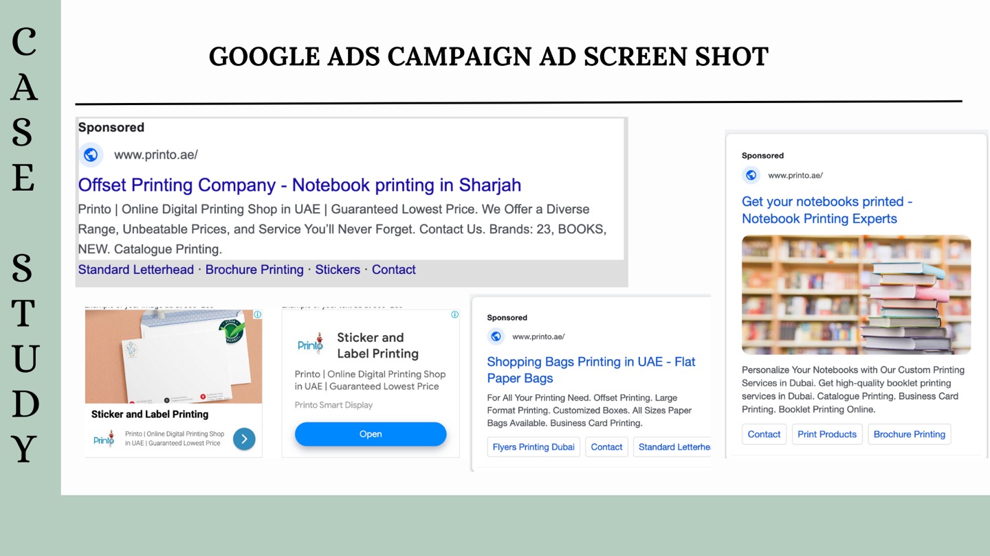 Ad match
The landing page should continue the ad promise, not restart the conversation with vague service copy.
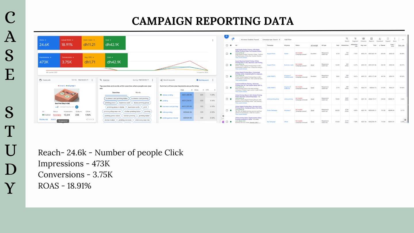 Result proof
CRO work should show up in conversion rate, cost per qualified lead, and fewer confused clicks.
The proof standard I use before recommending action
I look for a visible chain: campaign input, buyer signal, page behavior, tracked outcome, and a next decision. If one link is weak, the recommendation changes. That is why each post includes metrics, proof visuals, and internal links back to services, portfolio, products, or booking instead of ending with generic advice.
Where I start the audit
I start with the business result, then work backward into the campaign. That keeps the review grounded. A clean account is useful only if it helps the founder understand spend, lead quality, revenue risk, and the next action.
For a topic like Google Ads landing page CRO, the first question is not whether the setup looks modern. The first question is whether the setup can produce decisions a real team can trust.
Metrics only matter when they create a decision
The first screen decides whether the visitor understands the offer quickly enough to continue.
Answering objections early reduces hesitation before forms, calls, or purchases.
Every CTA should move toward a real next action, not another vague page.
How I would apply this in a real account
The checks that matter most
- Repeat the core ad promise in the first viewport.
- Put proof close to the CTA, not buried near the footer.
- Shorten forms when the offer is early-stage.
- Answer price, timing, trust, and process objections.
- Make mobile sections scan in the order a buyer thinks.
signal flowCROGoogle Ads landing page CROThe logic behind the recommendation
How I would turn this into execution
Audit the current state around Google Ads landing page CRO, then separate real buyer signal from reporting noise.
Create the smallest useful fix: campaign split, landing-page block, tracking cleanup, SEO section, or dashboard view.
Turn the insight into one next step: fix the account, rebuild the page, improve tracking, test the offer, or scale only after the signal is clean.
What I would not overcomplicate
I would not rebuild everything on the first day. I would protect what is already working, isolate the weakest signals, and fix the parts that are making the account learn from the wrong behavior.
Most improvements come from simple, disciplined work: clearer structure, cleaner tracking, stronger landing pages, better proof, and reporting that says what changed and why it matters.
Where this connects on my site
I use blog posts to support the commercial pages, not to sit alone. If this topic is relevant to you, the next useful step is usually a service page, proof page, product resource, or booking page.
result boardCROGoogle Ads landing page CROThe decision I want by the end
By the end of the review, the founder should know what to scale, what to pause, what to test, and what needs better data before more budget goes in. That is the difference between activity and strategy.
If you are comparing options, save this post and use it as a working checklist. A calm account review now is usually cheaper than guessing after spend has already gone up.